Welcome to my blog

I hope you enjoy reading my posts, and please leave me a comment. I always enjoy reading them, and will try to visit you in return.

For security reasons for me and for you, I would appreciate it if you would leave your name on your comments.

You are welcome to copy any of my designs, as long as you do not take credit for them yourself. I am very happy for you to sell them. If I have used anyone else's design, I always try to give credit where it is due. If I have missed anything, please let me know and I will put things right.


This is intended to be mainly about my crafting stories, as a personal record of what I do. However, I interpret crafting quite widely, not just paper crafting but other things too. I have a butterfly mind and like to change from one thing to another depending on what I feel like on a given day - knitting, crochet, cross-stitch, cards, baking and several others, including my favourite right now, parchment, both traditional skills and Groovi, very relaxing and calming to do.

I have decided to put some structure into my blog so that each day will have something of a theme.
Monday- for Mindfulness; Tuesday - Tidy Up Day; Wednesday - What's on Your Workdesk Wednesday; Thursday - Technique and Tips; Friday - Finish Off Day; Saturday - Start Something New; Sunday - Anything Goes
These themes are not hard and fast and will be changed if I feel the need.

Showing posts with label Clarity Stamps. Show all posts

Monday, 16 March 2015

Clarity Stamp Challenge March 2015 - Anything but a card

If this theme for a challenge had come up a few months ago, I would just have ditched any idea of taking part.  However, I think many of us are starting to take our card making further into canvases and boxes and coasters, things that we can display around our homes.  We have been encouraged, dragged and kicked down that route by some of the beautiful tools that have been presented to us and all the fantastic inspiration of Barbara Gray and her fabulous Design Team.

I very deliberately avoided looking at any of the wonderful things from the Design Team as I wanted my inspiration to come from within me and I had ideas anyway.

It just happened that my youngest granddaughter's birthday falls this month and I found just what I wanted at an excellent local craft store, Pink Tulip Creations Ltd at Spernal in Warwickshire (just down the road).  It was a little wooden box in the shape of a book.

It also just happened that Barbara Gray had showcased her beautiful Wee Fairies and Elves on Create and Craft at the start of the month.  So for a four year old, the castle and the fairies had to be put together for this project.


It took a while to work out how to prepare and do the initial painting as it was the first time I had done anything like this.  I tried inks but soon came to the conclusion that I would never get the effect I wanted that way, so settled on watered down acrylics, pale blue in the top half blending to pale green at the bottom.  I think I used at least three coats to cover it properly, then I left it to dry overnight.


The following day, I set to work with the Wee Fairies, Elves and the Castle, stamping them with Archival Black.  Because of the slightly rough grain of the wood, I got a slightly distressed effect from the stamping, which I preferred to a smooth version.  The castle in the centre was stamped and inked on Theuva card and put behind the removable glass (designed for a photo).


Once all the painting was finished and thoroughly dried, I used the Crafters Companion Spray and Shine to seal it and give it some protection.  I sat out in the conservatory in the sun with the box balanced on one hand while I sprayed and turned each side in turn to the sun to dry it off.  Good thing no-one came to the door while I was doing it  as I could not put it down until it was dry.


Then I had to possess my soul in patience until the lacquer was thoroughly dry and hardened off before I could put the inserts back into place.  That was hard as I am not a desperately patient person.  I wanted it done right then.


The card was also covered with the castle and fairies.  I already had the background done from when I was filling in time at a class, waiting for everyone else to get to the right stage to continue that project.  
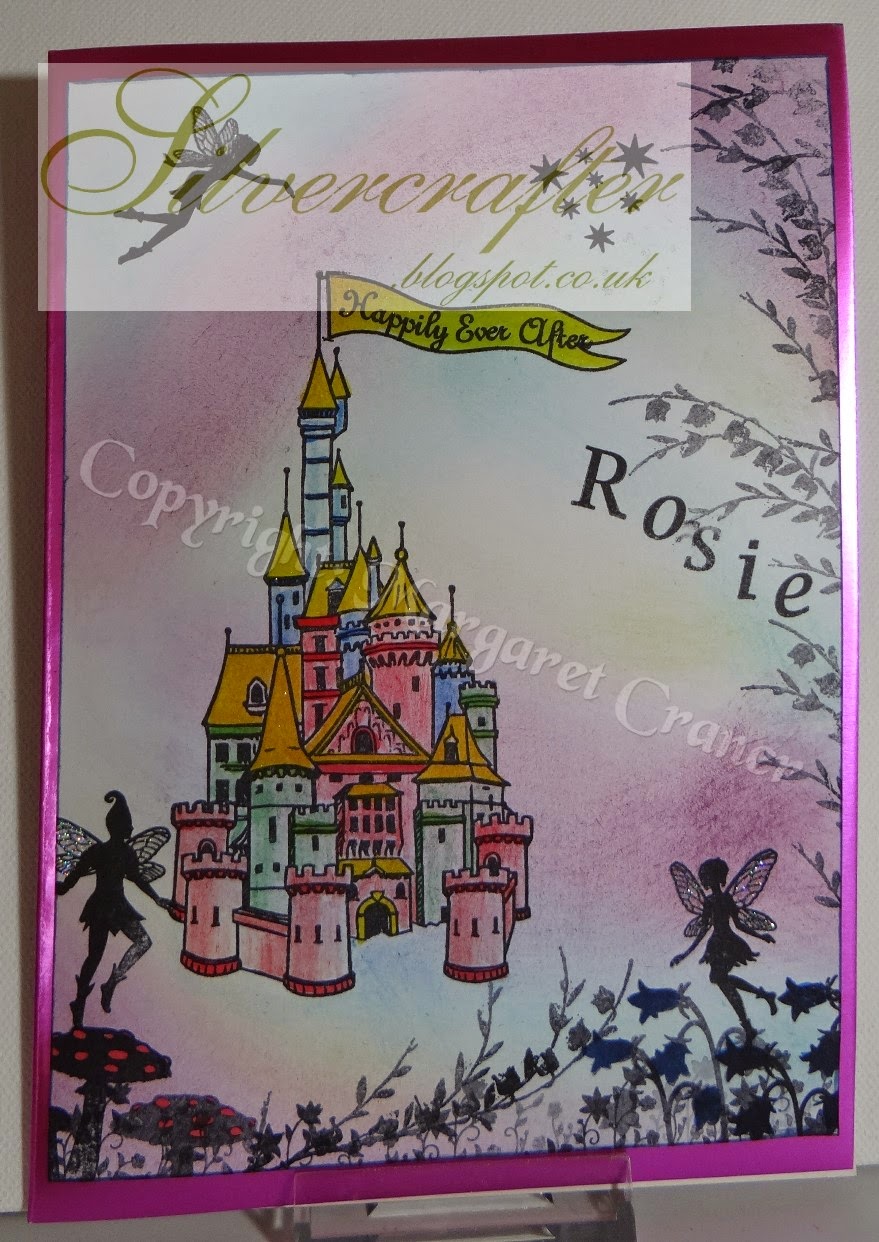
So all I need to do was the stamping of the images and colour them in with Derwent Coloursoft pencils which blend so beautifully.

As you can see, I have just learned to put watermarks on all my pictures to give my designs some protection so I hope you can see everything through them.

Ingredients
Wooden box (Pink Tulip Creations Ltd)
Wee Fairies (Clarity Stamp)
Wee Elves ( Clarity Stamps)
Castle (Clarity Stamps)
Letterbox Stamps (Clarity Stamps) 
Theuva Card (Clarity Stamps)
System 3 Acrylic Paints
Derwent Coloursoft Pencils
Crafters Companion Spray and Shine

Rosie was supposed to get this last Saturday, but the arrangements were changed at the last moment, but I am hoping that she will see it for real later this week.  I am off now to link this post up to enter the Clarity Stamp Challenge before March disappears completely.

Sunday, 16 February 2014

February, Craft A Scene Design Team - My Favourite Technique 2

This card is my second offering for this month as a member of the Craft A Scene Design Team.  This month's theme is Use Your favourite Technique - to produce a card that is a scene, but showing us, at the same time, how you love to work. So it is a two part challenge, your own technique but still creating a scene with a background and a foreground. 

Before I go any further with this post, I want to make it very clear that the inspiration for this card comes entirely from Barbara Gray from Clarity Stamps, and was from one of her recent blog tutorials.  If you want to see what she did, just follow this link http://barbaragrayblog.blogspot.co.uk/2014/02/china-blue-duck.html  and you can read exactly what she did.

Mine is slightly different, partly because I did not have all the things she used, I did it on different card, and I am not as talented as Barbara is.

Ingredients

Theuva card (Clarity)
Large moon mask
Low tack masking tape
Speedball brayer
SplodgeAway mat or Claritymat
Adirondack ink pad - Juniper
Adirondack ink pad - Denim
Adirondack ink pad - Pitch Black
Clarity Stamps - Large sapling, small sapling, remountable flying duck
Copy paper

 The first thing to do is to attach the Theuva card to a piece of copy paper with the low tack tape.  It is a good idea to detack the masking tape further by sticking it to your jumper before using it on your card.  Then decide where you want your moon and place your moon mask.  If you don't have a ready made mask, cut one out of the sticky end of a post it note.

Then take a piece of cheap copy paper and tear it in half lengthways to form hill shapes.

Using the Juniper, load your brayer and spread it on the Splodge mat, ensuring that what will be the leading edge of the brayer remains free of ink.  Cover the whole piece of card with the Juniper, making sure that you lift the brayer after each pass across the card.  That helps to avoid the dreaded stripes.  return to the mat to reload the brayer, still keeping that leading edge clear of ink.

 As you can see from this picture above, the Juniper is virtually invisible, but it provides a good base for the darker ink.

Then lay down the Denim ink on the mat  by the side of the Juniper, load your brayer and start to bring it in from the top corner, reloading the brayer as you go, gradually darkening it as you go.  Then turn the artwork round, ready to work in from the bottom.  Using your brayer, work the edges of the Juniper and Denim inks together, still keeping that leading edge clean.

Holding your torn copy paper at the top of your first hill (remember that the darker one will be at the front of your picture, and the ones further back will be progressively lighter), start brayering in from the corner.

 Move your piece of paper up the card to where you want your second and lighter hill, and repeat the exercise.

 When you have finished your hills, remove the moon mask and put it away safely for another time. 
Load your large foliage tree stamp with ink from what is left on the mat and stamp it at the base of your card
 The small tree is treated the same but keeping it lighter in colour to help the perspective, and place it on another hill.  Don't worry if you don't seem to have enough difference between them  That can be sorted out later.
 Then ink up the duck direct from the ink pad and stamp it where you feel it looks best.  Barbara used the same duck but only one.  However, I had a different type of card and a larger piece and I felt that mine needed the three ducks to give balance.
 Both Barbara and I were not happy with our trees, so I followed her example and used a dark blue Promarker to tidy things up.  I also felt I did not have enough definition between the hills, so again I followed Barbara's example of using furrows using a dark promarker.
 When you remove the masking tape, make sure that you pull it gently away from the centre of the card to avoid tearing your beautiful work.  The final step was to trim the card right down to tidy it up, then mount it on another piece of Theuva card, then into a piece of dark blue pearlescent card.

 There has been a lot of people recently stealing the designs of others.  I am happy for anyone to copy what I have done, provided that they give credit to the original.  In my case, I am giving the credit fairly and squarely to Barbara Gray and thank her very much for her brilliant designs and stamps and her willingness to share her tips and techniques.  I hope you will take the time to follow the link and read her original post.

Even more do I hope that you will take the time to produce a real scenic card to enter into the Craft A Scene Challenge this month.  Take care, though.  This is my second attempt to do a card for this week.  I had intended to do an urgently needed birthday card that would also fit the brief, and suddenly realised that my birthday card was fine, but did not fit the brief of making a scene.  so that one was sent off and I started again with a tighter control over what I was doing to ensure I complied with the rules.

Sunday, 28 April 2013

Craft A Scene April 28th - Farm Scene

This is a scheduled post.

This is the final chance to join in this month's challenge over at Craft A Scene.  The theme is for a "Down on the Farm/Ranch" scene.  The idea is to give everyone a chance to produce a scene that is familiar to them, no matter where you live.  Your scene should include a background and a foreground and show a complete scene.  What media you use is up to you, whether it be stamping, decoupage or draw your own.  Use what you have with your imagination, and have fun.  That is what crafting should be about.

If you have seen my two previous offerings on this theme, you will have noticed that I have been using Hobby Art Stamps to create this month's cards.  I have three different sets of farm stamps, and this card involves bits from all of them.  I had not realised just how many different sheep stamps there were between the three different sets.  I mount all of my stamps on Clarity mounts which are so easy to use and to place accurately.  they are excellent if you have any dexterity problems, being perfectly balance.

I also used pencil lines to join different scenery stamps to make them one and to draw in in some field boundaries.  All the colouring is done with Derwent watercolour pencils, which I love.  Some of it has water applied but not all.  I also used a Twinkling H2O on the stream and pond, and also for the rays of the sun.  As usual, you cannot really see that on the photo, but it is there.

This farm scene is not really like most farms these days, but I wanted to try to recreate what farms used to be, a mix of arable and grazing, small fields with hedges, with a village close by.  Most arable farmers these days would have a fit to see bright red poppies in the middle of the corn and wheat fields, but I remember that from my childhood, along with grass verges full of beautiful wild flowers, full of busy insects and birdlife.  

Although I have not used any of my favourite Clarity Stamps on this image, most of the techniques used have been learned from watching the very talented Barbara Gray.  I heard her say recently that when she is travelling (and she does an awful lot of that) she is constantly seeing the folds of the hills, the way trees grow and generally picking up inspiration.  While I do not pretend to have a fraction of her talent, I have caught myself seeing the landscape in a different way, and planning scenes around what I see.  I bet you do the same if you think about it.  So come on and join us, show us something of what your eyes can see as you go about your life and travel through the countryside.  Have fun.

Thursday, 21 March 2013

Clarity Stamps, a Brayer and a Splodge Away Mat - essential! And a Snippet


Two very different cards, but both using Clarity Stamps.  This first one, is fairly simple to achieve.  The background is one that I had in the box from when I used to just play with the bits left over from the paper with the excess ink from the brayer.  I liked the way this one was blended across the paper, giving a real feel of heat.  The stamps is a Clarity one, the Daydreamer, and I just stamped it direct to the background with black Adirondack.  This is my Snippet card for Pixie's Snippet Challenge for this week - all the bits came from the bits box.


The second card is a completely different kettle of fish, and took a long time to work out.  Before I started this card, my desk was tidy.  Now the entire room looks as if a bomb has gone off in there.  All the stuff I showed yesterday is still there but either buried or shoved to the left.  I had to finish this card today as it is needed tomorrow lunchtime, so tidying up was not an option.

I wanted a card very simple in style for this friend.  She definitely likes the LIM style and also likes the elegant lady type of card.  The lady is the Large Sketchy Lady from Clarity Stamps, and was the first thing to put into place.  I also had to cut myself a mask to protect this image from the rest of the card.  You may recognise the Paris skyline at the bottom, which is actually the ready cut mask from Clarity.  I had to cut the card down a bit as the Eiffel Tower would otherwise have been totally hidden by the lady, so it had to move a bit.  I used a make up sponge to apply the colours to the skyline from the Soothing Sunset Big and Juicy inkpad, keeping the colour paler on the side nearest the sun.  Once I was happy with that, I swapped the one mask for the other (with the masks from Clarity you get the innie and the outie, for the want of a better description), and used the same inkpad to brayer the background.   Then I loaded the brayer with the blue from the Waterfall Big and Juicy to brayer round the edges.

Once all the background was complete, I removed the mask from the lady and coloured her face and neck and legs with a Promarker, and a purple one for her shoes.  Then I got out something I have had around for ages and not tried - the Angelina fibre and film.   Then I had to extract the travel iron form beneath a mountain of other stuff and put it together and get it heated up - it has never been used since we bought it for the caravan years ago.  I inked up the lady with Stazon and put her onto the stand, then loaded it with two colours of fibre and film.  I did remember to put a piece of cooking parchment on top to protect the iron, then applied heat until the ink showed through all over, let it cool and removed it from the stamp.    Then I cut around her, removing the dress and the hat, all the rest going back into a bag for use on another project later.  The dress and the hat then had a bit of Pinflair glue gel on the back to attach it to the stamped image.  The only other thing was the addition of a silver peel off which I coloured with a purple Promarker to blend with the lady and the background, and I edged the card with the same Promarker.

Several people have asked me recently what the benefits are of using a Splodge mat, I thought I would write down the advantages I have found so far.  
I used the Splodge mat to hold the colour I wanted, which means you save a massive amount of ink and get much more control over the application.  This brilliant mat just holds the ink for you to return to as needed, and only gives as much as you need.  I used it for the sponge and definitely for the brayer work.  
It makes brayering almost foolproof, but even more important in these cash strapped days, it save on ink and paper.  No longer do you need to ink up the brayer heavily and lay most of it down on scrap paper and repeat the process several times to get the right colour level.  No wheelies either.  You just ink up the centre of the brayer, and work it well into the Splodge mat, and work your ink from there.  Instead of going back to the pad for more ink, you just return to the mat for your refill.
You can also use the mat for stamping, just inking your stamp from the ink on the mat.  Again, you get just the right amount of ink for a perfect image..  
Don't be in too much of a hurry to clean off your mat (all that needs is water and kitchen paper - never use a baby wipe).  The ink will stay usable on the mat for several days - I have left it for a week and still been able to use it successfully.

Hope this is a help to anyone who is thinking about buying a Splodge Away Mat.  I can only speak about the genuine mat, not the seemingly similar mats that have appeared since.  My feeling is always that you should try to use the best tools - they usually work out cheaper in the end, and give you the best results.

Sunday, 17 March 2013

Clarity and Decoupage


Having joined most of the rest of the country in being knocked flat by the rotten flu type cold last week, I am now playing catch up with the cards I need NOW.  These are two I managed to get done yesterday (four more to do). 
This first card is for a wedding yesterday - talk about cutting it fine.  We hand delivered it yesterday morning.  The lilies of the valley stamp is a Clarity stamp, the smaller version of the one shown on Create and Craft this month.  I had thought I had the large one so I had to rethink the whole idea rather rapidly.  

I did not have the sentiment stamp, so I typed that first onto the card, and stamped the flowers round it.  I coloured them with Promarkers, and them embossed the white flowers with Detail White embossing powder.  I used my Speedball brayer and the wonderful Splodge Away Mat to "airbrush" around the edge of the topper with Adirondack butterscotch, before mounting it on brown and then gold card.

I don't often use ribbon and other bits, but this one did need extra.  I had intended to do a double bow, but I could not remember how to do that in a rush, and actually, I think it is better with just a simple single bow, and the three crystal hearts.

This second card is for friends who are moving from the middle of Sherwood Forest to the outskirts of Bridport, a very different area.

The photo in the centre is one I found ages ago, and could have been a postcard originally, but I changed it by decoupaging it.  I would probably not use photographic paper in the future as cutting it does tend to leave white edges, which are more visible in close up.  The church tower is not only curled but folded along the one edge to give it more perspective.  Gluing it in place requires different thicknesses of Pinflair glue.  I don't think you could get the right effect with sticky pads, and I have got rid of most of mine as they were just sitting there taking up more space.  

The flowers and the bees are just a part of  the Floral Corner set from Clarity Stamps.  There are other pieces in the set, a long piece which joins the corners, and three other insects, a ladybird and a dragonfly, and a caterpillar.    I coloured them with the softer colours of Promarkers and edged each corner with Powder Blue Promarker. 

I also used the ink that was left on the Splodge mat from the previous day and was still very workable to brayer around the outside of the card.  (I am going to leave the ink there for another couple of days and see how long this ink will last.  It certainly saves money using the Splodge Mat, saving ink and paper.) Then I edged the card with my Krylon gold leaf pen, and also added little highlights to the bees and some of the flower centres.  Just one tip, never try to brayer over the top of gold leaf pens or anything like that - you will probably ruin your brayer and definitely ruin your careful work. (Oh yes, I have done it, so I know from experience.)

Unfortunately, both these cards are going to need a trip to the post office, the first one because the envelope I made is a touch oversized and needs a larger package to fit, and the second one because of the depth of decoupage.  Didn't think those through very well, did I?  Oh well, I shall have to add the cost to the next mortgage to the Royal Mail.  Just had a thought - I wonder if the Queen gets her post free as it is delivered by the Royal Mail - probably not!

Sadly, there will not be any paper crafting done today.  We need some fresh bread and probably some cake too.  We also want to test out our new ice cream maker.  So it will be a different type of crafting for today.

Saturday, 16 March 2013

Clarity Challenge No 1 - March

March 1st was "D" day for Clarity Stamps fans, being the launch of the Clarity Challenge Blog.  The very first challenge is "Anything Goes", which left it completely open to choose theme, style or what we wanted to make.  The only stipulation is to use Clarity stamps, which still gives us a pretty wide choice.

I could not decide what to choose, but this card made itself.  It was intended to be a scene for another challenge, but just would not go in that direction, so I just let it go where it wanted.  The stamps are all Clarity.  The only extras are a few pencil lines to extend the ground slopes and a few animals in the distance.  I also drew in a smaller cabin with a man coming out with his dog, up in the top right, among the trees.

Stamps used:- Large sprucescape, small spruce, wooden cabin, and the two riders
Other things used:- Watercolour card, Derwent Watercolour Pencils, Derwent Graphics Pencils, Twinkling H2O (To highlight the sun's rays, but it does not show up on the photos), PDA Pearlescent Card for mounting.

I also put in the pond close to the cabin, just using the watercolours.  It was intended to be a stream coming down the hills, but just looked wrong so I settled for the pond.  I also wanted to put in some more animals closer in but my drawing is not good enough yet - something else to aim at for the future.  

I love using the watercolour pencils and they are my media of choice at the moment.  They give you the chance to get good delicate shading and are more forgiving than Promarkers for landscapes.  On this occasion, I used them dry, except for the water in the pond.   when I do use water, any watercolour purist would have a fit to see that I use a waterbrush, the sort with the barrel full of water.  It is much safer in the caravan when you have two hurricane dogs, who launch themselves at the window if they see a bird or another dog.  I got used to using it there and tend to stick to it at home.  Used gently, you can get quite delicate lines.

Now I am off to post this to the Clarity Blog and then to have a look at what everyone else has done.  I avoided doing that earlier as I wanted to go my own way without taking anything from anyone else..  Can't wait to see now.

To all those lovely people out there in Blogland, thank you so much for all your good wishes while I had that fluey thing, and I hope that anyone else who has it soon feels much better.

Sunday, 3 March 2013

Craft A Scene - March 3rd

This is my first DT offering for Craft A Scene Challenge for March, which is Tropical Shores.  The challenge require some use of palm trees.

This one is made up from a mixture of images.  There is a combination of two images from Make It Crafty, which I welded together to get the combination I wanted. 
Image 1

Image 2


There are also four separate stamps from Clarity Stamps added to the mix, the galleon, the little boat, the seagulls and the flight of birds.  None of them were quite the right size to fit the main image, so I stamped them on to a clean piece of white paper, scanned them, then resized them to fit where I wanted.  The little boat is part of a set of remountables and also has a lady in the boat, which I removed for this picture, then I also did a reverse print and make it slightly smaller to keep the perspective. Doing this means I can make even more use of well loved stamps, mixing digital and stamped images.

The colouring was done using Derwent watercolour pencils, one of my favourites for playing.  I mounted the topper on dark royal blue pearlescent card and then on to coppery colour pearlescent card.  

Having seen my offering for this week, why don't you go over to Craft A Scene and join in with this month's challenge.

Tuesday, 21 August 2012

Pretty Petals - Homework Part 2


These cards were done in a similar way to the previous post, using the Clarity Pretty Petals Kit.  Instead of using an ink pad to colour in the petal shapes, I did them with several layers of Sakura pens to give them more of a shimmer.  I thought it suited the butterflies to be glittery too, and I enjoyed getting the glitter pens out again after forgetting them for so long.  

The sentiment is another Clarity stamp.  I found several of them that I really liked in the half price sale, and this is one of them.

 This last card is actually an easel card.  Like all the others, it was done on ordinary white card, but with this last one, I gave it a good dose of Crafters companion Spray and Shine after I had finished.  I did brayer the corners lightly to give it a halo effect before spraying.  Then I mounted it on black card and then onto the gold coloured card to match the flower. 

I was quite chuffed to see all my Homework cards shown on this month's Classroom show and to hear Barbara's comments about them.  It did give me quite a lift, so thank you, Barbara.


Pretty Petal Kit - Homework

I actually managed to get some homework cards done for the Clarity Stamps Pretty Petals Kit.  When I first saw this set, I knew it had lots of possibilities, so I finally bought the bullet and ordered it.  When it arrived, I was a little snowed under and did not have the time to play that I would have wished for.  For those of you who have not seen this set, it consists of 7 petal shapes, two of which are outlines, and a large butterfly (suitable for using with fusible film and fibre). 
This first card was done with one of the Big and Juicy ink pads.  The petals were just stamped as the border on the left, using the dotted border and the solid filler.  When they were dry, I brushed them over with Irridescent medium.  The humming bird is another Clarity stamp I found in a shop ages ago, and it just seemed to fit this project, although it took two days to find it.  Needless to say, it was exactly where it should have been, six inches from my hand.  Once it was dry, I used the Promarker thin black to outline it.

The second card also used the Pretty Petals, and was stamped with another Big and Juicy.  I used the solid outliner and infilled with the solid filler petal for the leaves.  I used the thin Promaker to draw in the stem and the leaf veins.  The flower itself needed some masking with post it notes to fit the petals together.  The sepals (the outside green bits - I had to look up the right name) were filled in with the dotty petal shape,  I actually used a purple Sakura pen over the top of the purple ink on the petals.
I will show the others I did later this week - when I can find what I have done with the photos.
. 

Monday, 20 August 2012

I love this stamp

This card is really a change ton the one I posted earlier, but I needed to add a bit more to it for our grandson.  All but one of these stamps are from the Clarity range.  The odd one out is the Happy Birthday and it shows.  The stamp nearly tore in two when I tried to remove it from the acetate. 

I found the spaniel in the 1/2 price sale at Clarity and knew I had a good use for it.  Again I used the Vintage Photo Distress ink pad, and coloured it in with a water brush.  The ball was sponged through a punched circle with a make-up sponge.  I used a larger sun/moon when I was brayering the background.  The tree was one of the split trees, and I used one of the leaf sets to decorate it (not to mention to cover up a couple of ink marks which appeared because I failed to take enough care with dirty fingers).  I did try to create a cloudy effect but that did not work, probably because it was just ordinary card rather than Clarity card.  The birds were from the Harbour kit, and stamped with second generation ink, as was the tree and twigs.

I might be in trouble for this card as our grandson desperately wants a dog, which is not a real possibility.  He will have to make do with coming to ours and walking one of our dogs. 


Wednesday, 9 May 2012

WOYWW - 153

My desk is a little tidier this week, mainly due to the fact that I wanted to play with mica powders today, and I did not want them mixed with everything else in sight.  You may wonder why I am showing you my desk and all that is on it.  After all, you may be new to the world of craft blogging, everyone is new at some time, and if you are, then you are very welcome.  Wednesdays are the days when our Lady Julia hosts us all at her place - Stamping Ground.  She very kindly allows us to join together and have the chance to get more inspiration from the work of others, and share our ideas and encouragement.  Some desks will terrify you and some will astound you, but you are welcome to all.  We just ask that you are patient with us and leave us a comment if you like what you see or have ideas to add.

I do have a couple of piles of projects off to the side, but not as much as usual.  Another reason for my tidy up was to find my Clarity Stamps Lovescape kit.  I knew I had it but it had got split up and distributed around my room.  You can see some of my mica powders and the brushes to applying them at the back on the right.  The little orange thing is my Fiskars finger scalpel, which is so easy to control as it becomes an extension of your finger.  My Ottlite is on show too, but as I took the photos on Tuesday afternoon, I did not need my light.  I could make do with that lovely yellow orb in the sky - I seem to remember it is called a sun, and it helps to make us warm too.  There is a small Really Useful Box at the back full of Promarker pen tops - I have changed all mine to the fine nibs, which I can remove if I really need to.  The yellow rubbish is the trimmings from the Clarity Adhesive sheets, which I used to make the two little pictures on top of the stack of white copy paper.

This is the first time I have tried this technique and it shows - I need a lot more practice to get the results I want.  I need to watch Barbara Gray a lot more to see where I am going wrong.  I think I need to take more time to mix my colours better before I start  - I never was the most patient person.  Slowly, slowly, catchee monkee, as the saying goes.  I am certainly not doing it justice at the moment.

I am off to bed now, so I shall be scheduling this post and link in properly when I get up.  I struggled to get round to all my visitors last week, and was horrendously late with some visits, for which I apologise.  I will try hard to do better this week, but please forgive me if I do not get there.    Thank you to all those who took the trouble to pop in during the week.  I really do appreciate all of you and especially what you have taken the trouble to write in your comments.

Wednesday, 18 April 2012

WOYWW - 150

One or two people complained last week that I restricted the view of my desk to hide the worst of the mess.  I have had a little bit of a tidy up today, putting away the equipment from the cards I have just finished, so there is room to do the next project.  For those who are now wondering why on earth I would bare my desk to the nation (well, Blogland, anyway), it is Wednesday, which means the wonderful blog hop hosted by Julia, which is when we all wander round and see what all our friends have got on their desks.  If you want to join in, just go to http://stamping-ground.blogspot.co.uk/.  some of us are tidy and some of us are not.  Like all friends, you must take us as you find us.  Whatever, you will find a real welcome, especially if you leave a comment, and if you need help or just a friendly word, you will find it there.

As you can see, I have been well looked after with hot drinks today.  I really must take the dirty cups downstairs when I go in a minute or two.  You may have realised by now that the photos were taken on Tuesday afternoon to take advantage of the natural light, but I still needed my Ottlite as the rain was hammering down (I know we need it).  My project for today is a bit of zentangle.  I have not done much of that, but I thought I would have a go for a challenge.  If it works, I can use it for a birthday card with a difference.  It is a combination of the Versatile Vase kit from Clarity, and a printed sentiment, which can also be zentangled.  To the side of that is another Clarity image - the two poppy stamps which fit together beautifully.

Moving to the left, you can see my computer monitor.  The wallpaper on the screen is one of my own photos of Marwood Hill Gardens in North Devon, a beautiful and very welcoming place to visit (dog friendly, too, we were met with dog biscuits for our two).  I love the beautiful silver birch bark on those trees.  You might also spot on the desk a little pot of natural dog treats.


Above my computer is a small notice board, on which you can see the lovely tag specially done for me by Debbie, a photo of the wedding of one of my school friends, ready printed to take to our annual reunion this weekend.  There is also my Patience Strong calendar, printed out from the Joanna Sheen CD.  I managed to pull it apart a couple of months ago, but I did finally get round to putting it back together again today.

As Julia has asked us to be brief, I think I had better finish for this week, and give you time to get round a few more desks.  Could I just add one little plea?  Blogger seems to have turned on the Word Verification on a lot of blogs over the last couple of weeks.  Please could you all check if this has happened to you?  If you do have it turned on, you may find that you are not getting as many visits as you do normally.

I will apologise if I am not very quick in getting round to visit you, but I will do my best.  Like many others, i now find it impossible to visit everyone each week, and find time to craft as well.  If you leave me a comment, especially if you add your number, I will get to see you asap.  I also visit anyone whose number fits the rule I have chosen for this week.   Have a great week, everyone.

Thursday, 12 April 2012

WOYWW 149 Follow on - Narrow Boats interpretation

Working Narrow Boat "Aquarius"
When you go to caravan rallies, you can have a follow on rally afterwards.  We had our usual WOYWW yesterday, so this is my follow on explanation.  A number of people gave me credit for having drawn the boat myself.  I wish!!!  I am not that talented.  So I thought I should make things clear.  I am not clever but I do enjoy manipulating images to get what I want.  That is my excuse for this post.and I am sticking to it.

For those of you who saw my canal boat card yesterday on WOYWW, I thought you might like to see the original photo from which I took my traced image to add to my Clarity stamps.

Traced and inked image of "Aquarius"
The first thing I have to tell you is that it is a narrow boat, not a barge.  If we ever slipped up and called it a barge, we got thoroughly told off.  The majority of the canal network will only take the narrow boats, and not the bigger Dutch Barge types, and some locks will only take the shorter narrow boats.

The hardest part, once the tracing was done, was to stick to what I could actually see on the photo and not to add in the things I could not see, but know are there.  For example, I know there is some beautiful sign writing on the side of the tiny living quarters, which is just not visible due to the angle of the photo.  The size of the card also limited the amount of detail that could be fitted in.
 
Traced and inked image of bridge before I reversed it
The same criteria really applied to the bridge too.  The picture I took that from was actually reversed so that the tow path was on the opposite side.  This did not fit in with using the stamp of the horse, and it was easier to reverse the bridge than to reverse the horse.  I could have been very nit picky and drawn all the bricks on the bridge, but I think that would have been too much detail for the size of the image, hence the artistic licence again and the roughly drawn huge blocks.   All bridges are numbered, as far as my limited knowledge tells me, so I chose the number of this bridge knowing that they would have travelled beneath it at some time.

Final Result (unless I decide to titivate it a bit more)
The colouring part of this card did show up the fact that I need more and varied greens, both in ink pads and Promarkers to get the real depth I wanted.  Failing that, a lot more practice in blending what I have to get the desired results.

Ingredients used:
White paper
White Centura pearl card
Copper Krylon pen
Tracing paper
Clarity Stamps - Horse, herons, bullrushes small and large (Canal barge Kit),  Geese (Small village set)
Adirondack ink pads: lettuce, cloudy blue, juniper, pitch black
Cut and Dry brush nibs
Promarkers: various
Pencil for tiny detail, like the fence on the hill and the obelisk
Brayer
Make up sponges

Saturday, 24 March 2012

Pixie's Snippets Challenge 13

I have been late for everything this week, but I was determined to make it into the playground in time.  I cannot miss my go on the swings.  I will be out there to play when I have handed in my homework to Miss Pixie. 

Number one is a leftover from a sheet of Debbi Moore ladies.  The main card was sent out months ago and the oddments have been in my box since then.  I just added a bit of my lovely Martha Stewart glitter to her dress and jewels to give it a lift.  Sadly, as usual, you cannot see the glitter, but it is there.

Number two is one of a batch of toppers I printed out and took on holiday last year to colour in.  It is printed on Clarity shiny silk card, and then coloured with my very limited Promarkers.  Sometimes, when you have a small range of colours, you have to get even more creative with the way you shade.  I think I could make a better job of this one if I did it again now, but I am not going to waste this topper.  Once it was coloured and dry, I polished it with a piece of kitchen roll, then added Krylon gold leaf round the edge.  I mounted it on a piece of lilac coloured textured paper and then onto white pearlescent card.

I used the same textured paper to mat this topper.  The sparkly bits were from a kit which I bought several years ago, with lovely flowery cards, and these sparkly peeloffs and glittery borders, and metallic flowers.  all of the items were pretty in their own way, but no way did they go together, so they got put into a box to be thought about.  I had a small set of pearlescent offcuts from PDA Card, and I used some of these to mount up these peeloffs.  This one looks better in real life than it does in this picture.  The scanner seems to have changed all the colours slightly and reduced the impact of the peeloffs.


These next two are from the same set, but backed onto dark blue card (should have been black, but I only have one sheet left).  The base cards are rejects from Kanban, being badly folded so they all need some trimming to tidy them up, but they are lovely colours, and pearlescent too.


The last one is a combination of papers and techniques.  It is a floral corner stamp from Clarity, my favourite company.  Again, I printed it out, but on ordinary smooth card this time.  I think I used Promarkers again for colouring in, but I did it so long ago that I cannot remember for certain.  I did it while we were away in the caravan, so it could also have been water colour pencils or even paints.  I found it floating around today, but could not find a stamp to put into the centre, so I decided to use one of the left over tags from a card I showed you a couple of weeks ago.  Hope you like it.

Right, I am off now to finish potting up the second batch of strawberry plants and the garlic cloves in the greenhouse.  Then I will join you all in the playground.  We could play "What's the time, Mr Wolf?"  Anyone want to join me?  (Don't forget Rudolph Day tomorrow, 25th March.)